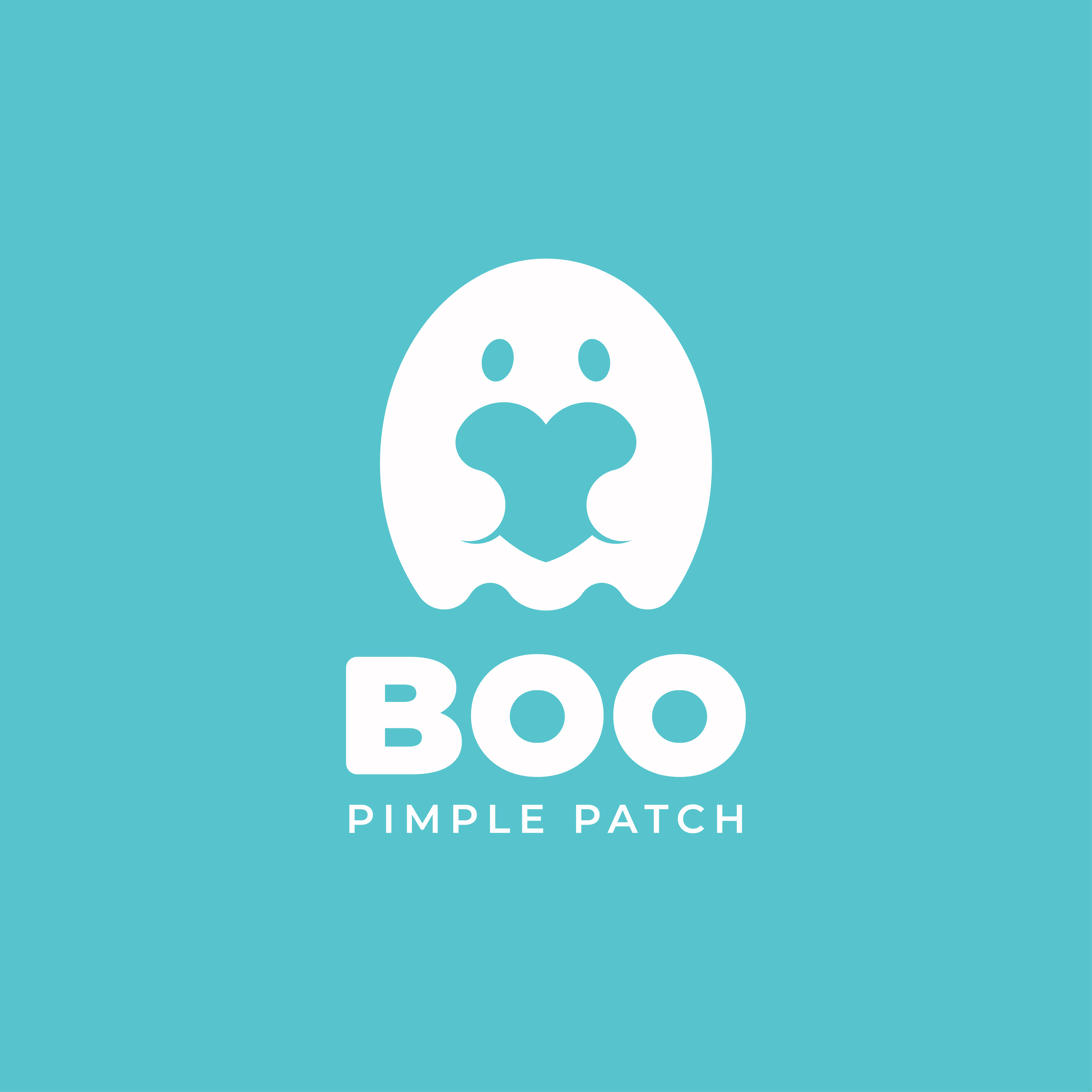
My first task was to create the mascot logo, the heart of Boo's brand identity. After sketching and brainstorming, I developed the concept of fusing two different definitions of the word "Boo": one being a shout to surprise someone, and the other an affectionate nickname for a partner. This approach perfectly aligned with the client's request, giving the ghost a cute and harmless appearance while also associating it with the idea of loving your skin.
The mascot was created using Adobe Illustrator's Shape Builder tool, exclusively using ovals and circles. This technique provides the character with a pleasing optical balance and a soft, friendly appearance.
The client and I chose a bold turquoise colour to appeal to a wide audience while still maintaining the brand's cute and friendly aesthetic.

This is the mock-up I created for production purposes to ensure that the factories had a clear understanding of my client's vision. Additionally, this mock-up will be featured on the Boo Pimple Patch website to showcase the product.
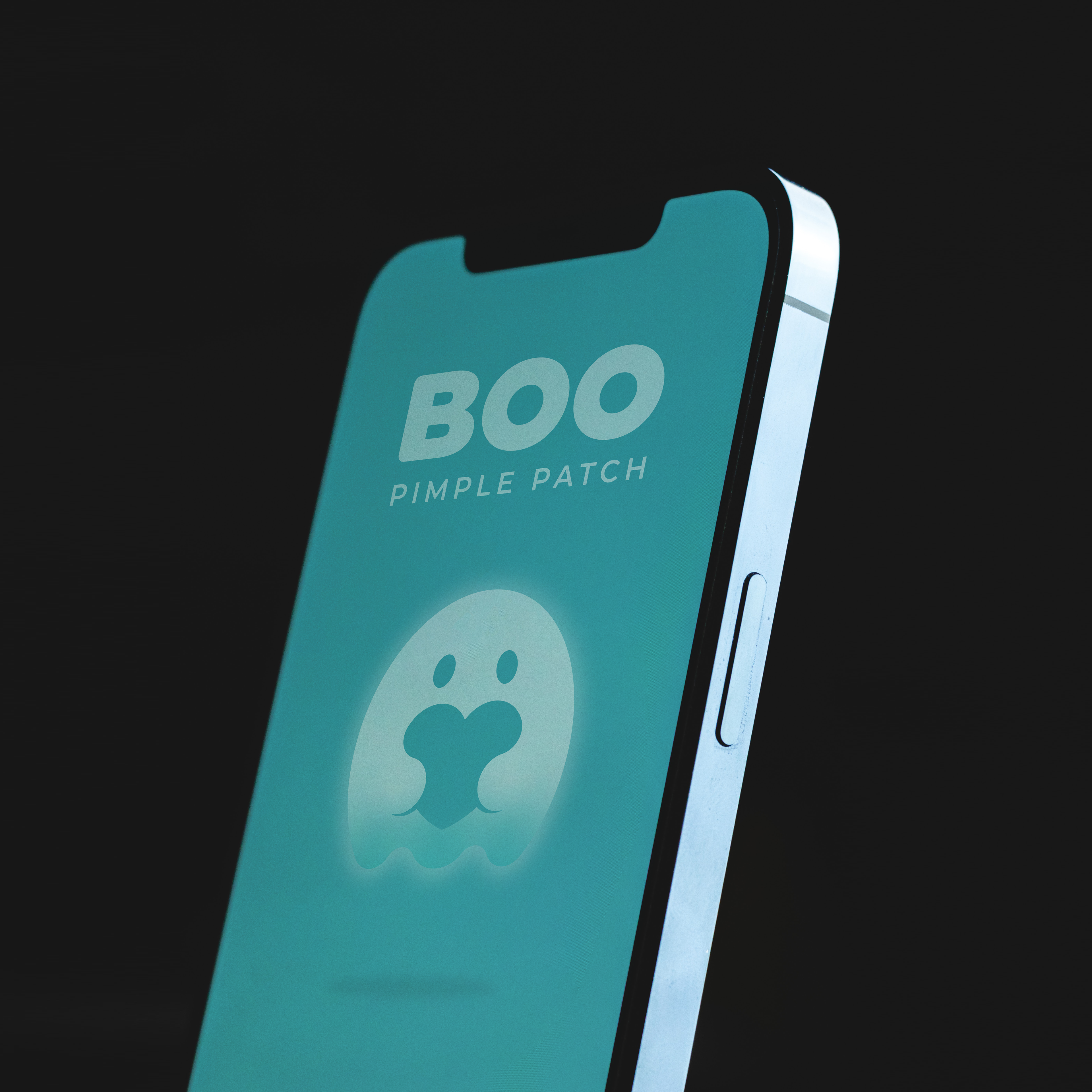
This is the 3-D illustrated version of the logo, which is featured on the Pimple Patch sachet inside the box. It is also used to stand out in smaller spaces, such as social media profile pictures.
Stacked Type Logo
This logo is featured on the front of the Boo Pimple Patch boxes. I used elements from the logo such as the "PIMPLE PATCH" type, to determine the scale and spacing of the logos assets in comparison to one another for optical balance.
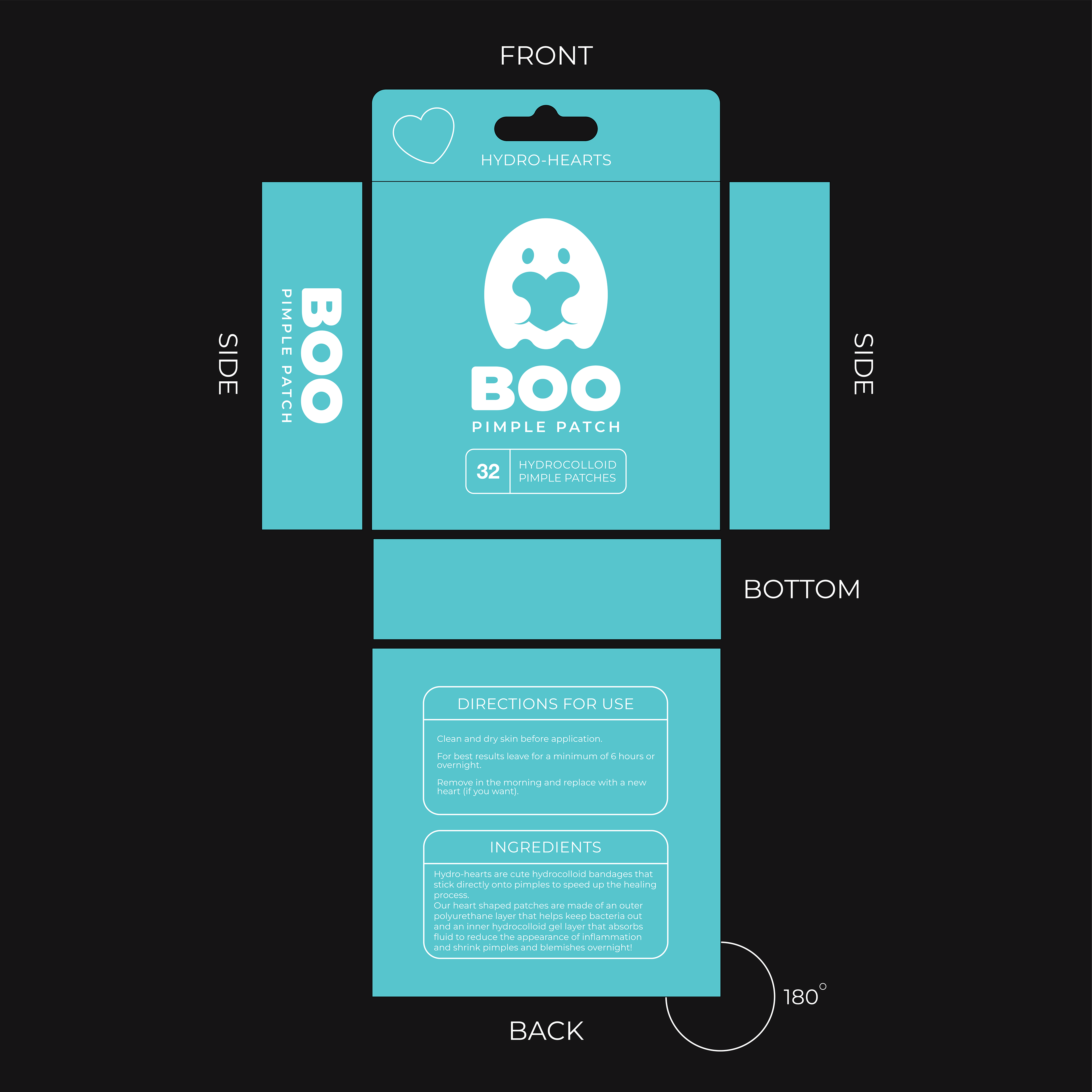
Box Design mock-up created in Illustrator so the manufacturers had a good understanding of what my client was looking for in his product packaging.
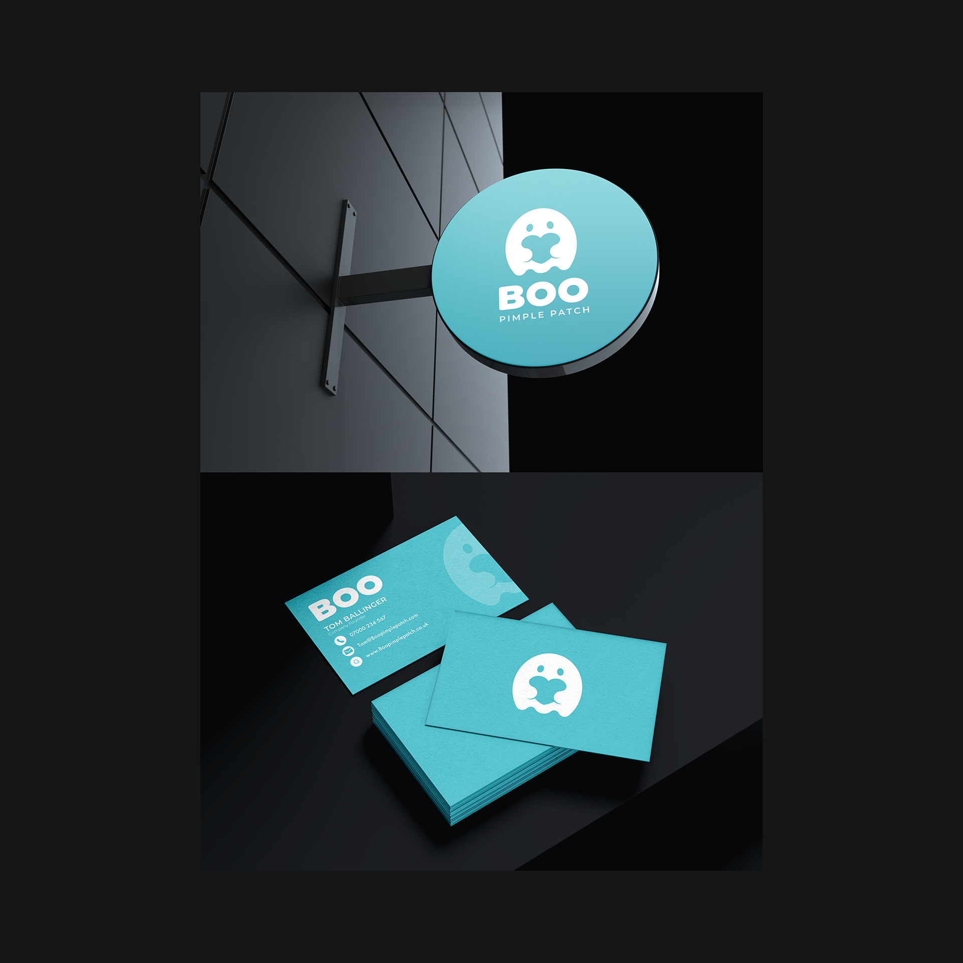
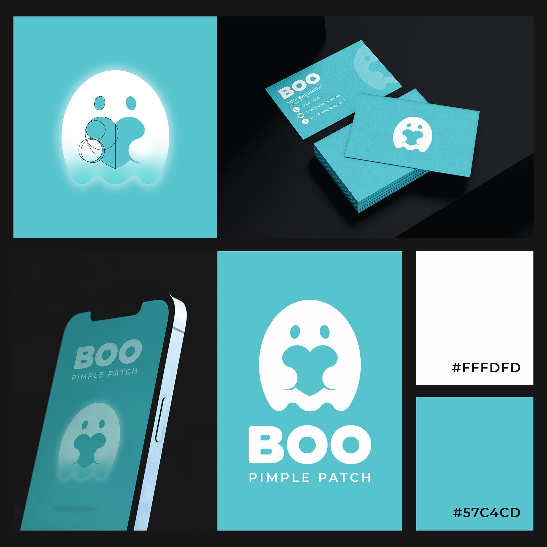
Store Sign and Business Card Mockups.

Business Card Mockup.
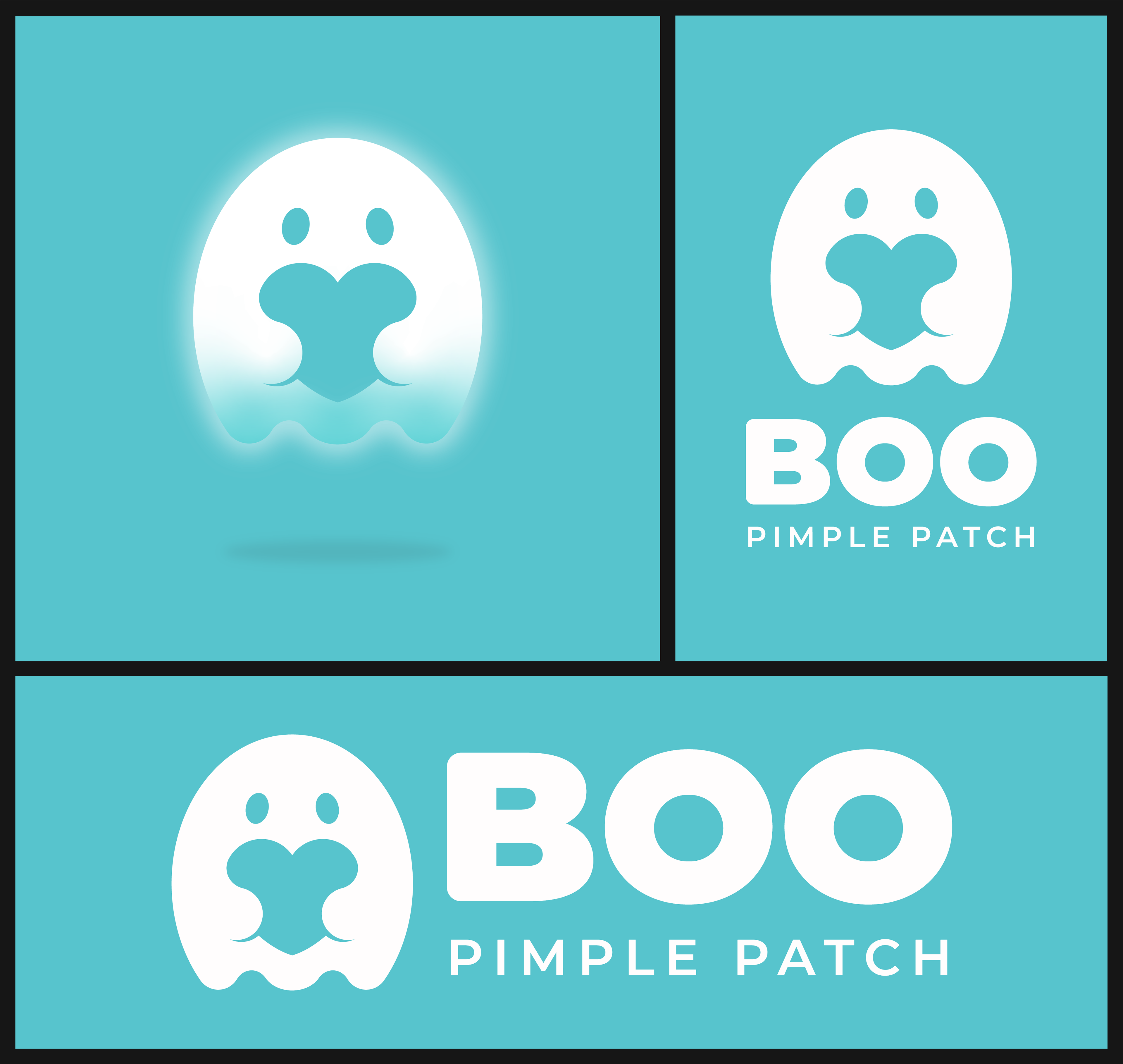
Logo Presentation Board.
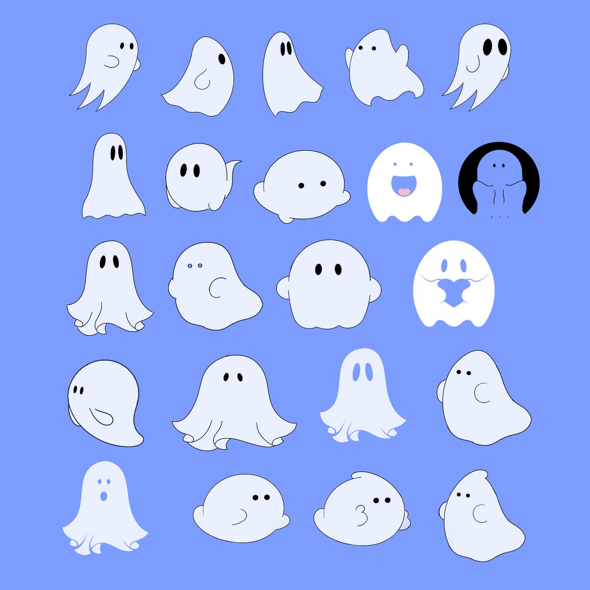
Initial sketches and ideas created in Procreate for iPad.