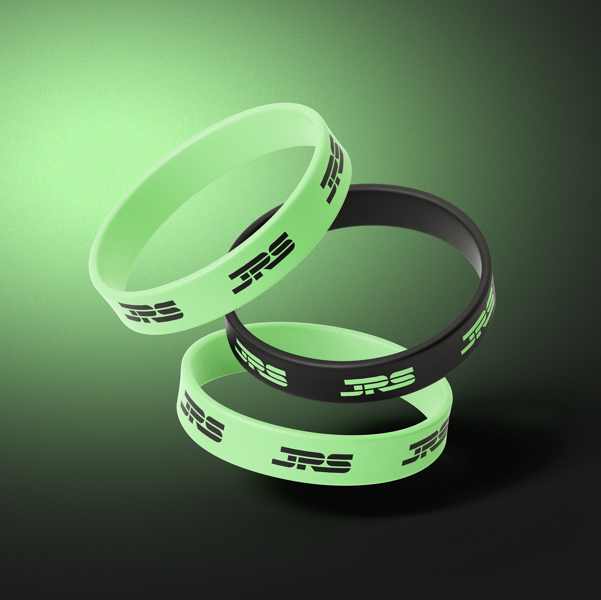
Colour
The primary colour is a neon green, inspired by safety workwear, to create a strong connection to the scaffolding trade and ensure the branding stands out. Familiarity of safety workwear colours may also evoke a sense of trust between the Company and customer.
The secondary colour is a lighter shade of black, chosen to contrast with the green while being easy on the eyes, making important information clear to see and easy to read.
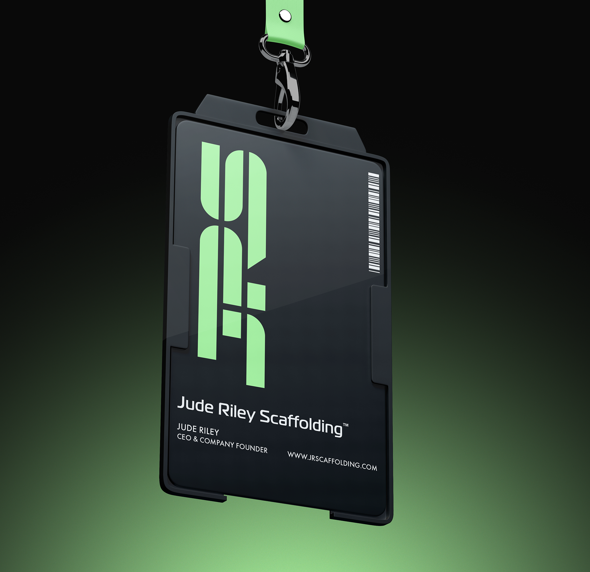
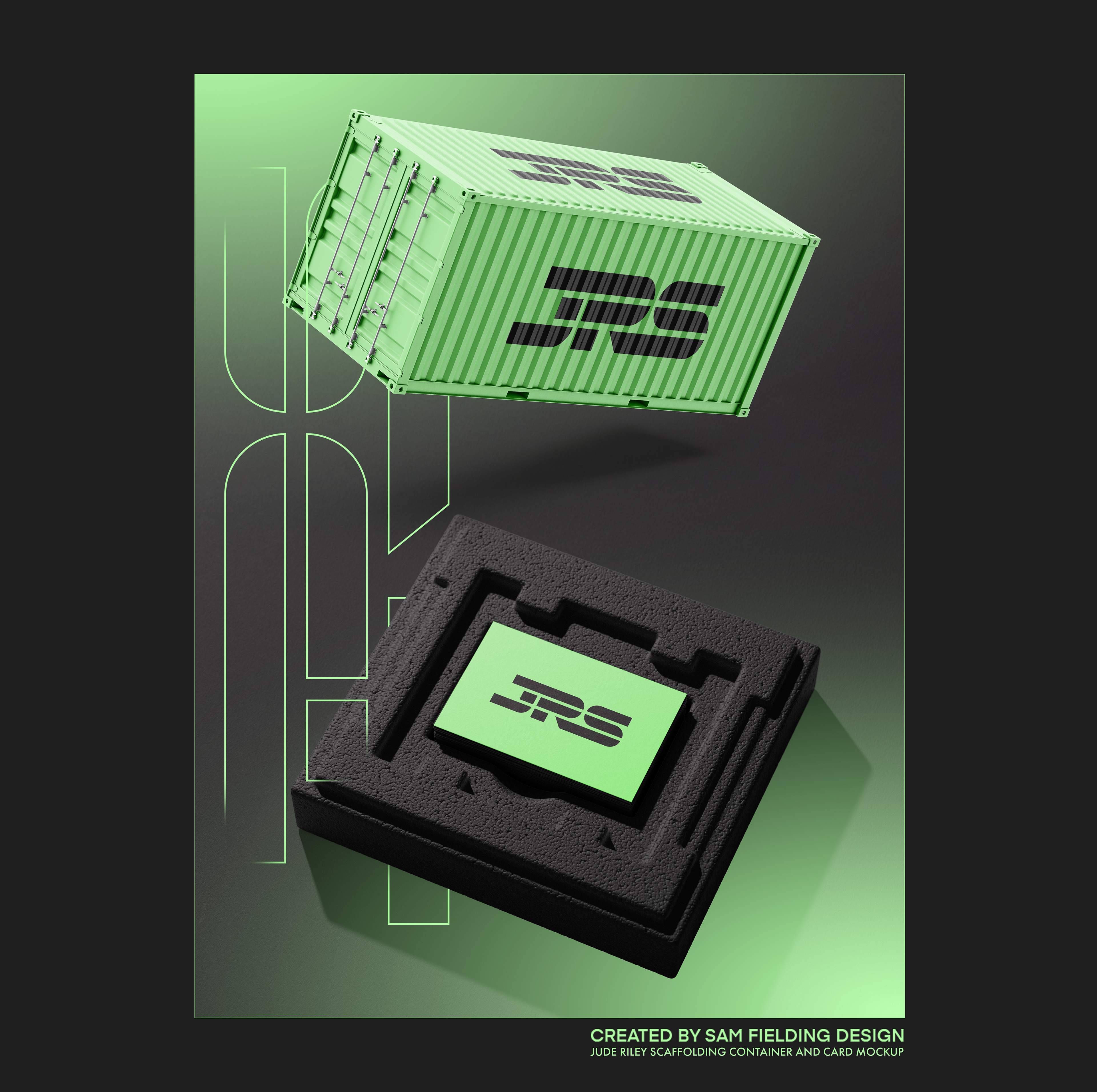
Identity Card mock-up.

Negative Colour Presentation
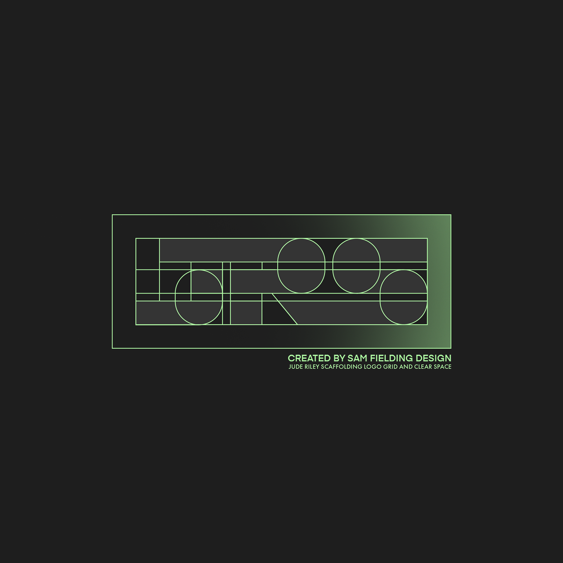
I believe an eligible logo should often work with the colours reversed as it may be presented in numerous different medias and scenarios. This demonstration serves the purpose of proving the colours contrast well both ways.
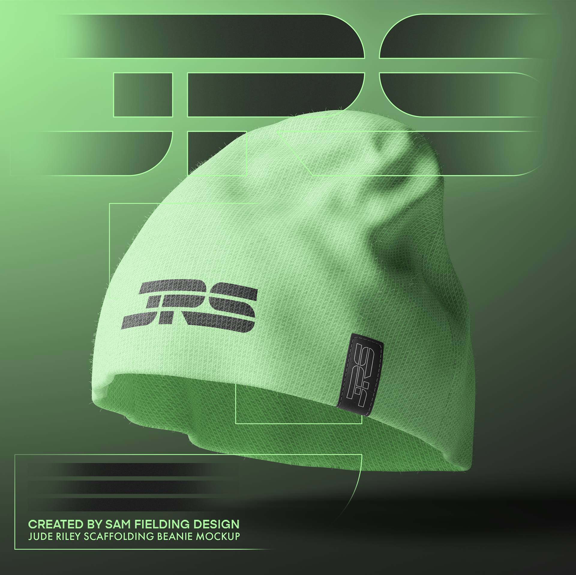
Mockups
In the mockups and branding, I have employed soft gradients and subtle outlines of the JRS company logo. These elements overlap and fade across different areas of the designs, filling negative space and providing balance and structure that flows consistently throughout the brand's identity.