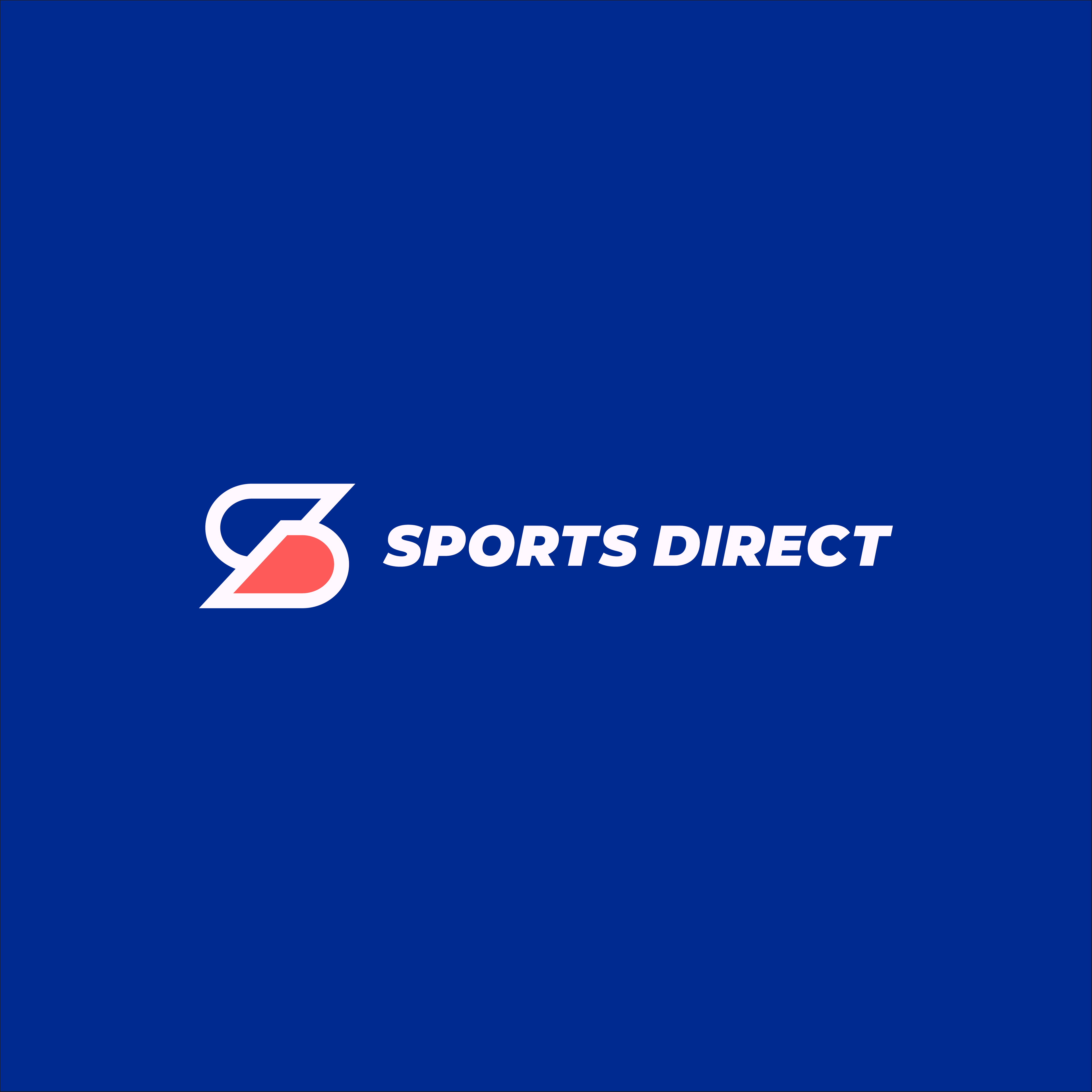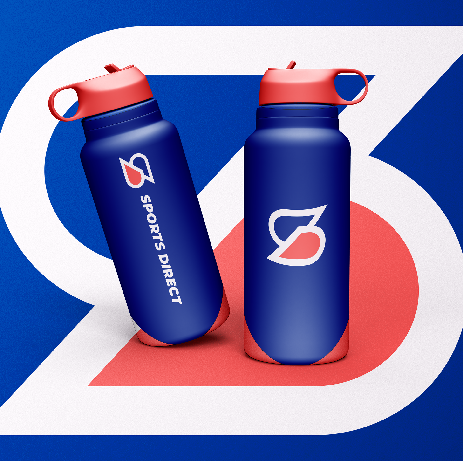
Sports Direct Concept
I created this rebrand project to challenge myself and elevate my branding skills. The logo fuses the brand initials by using two reflected D’s joined together to form the primary initial “S.” The monogram, as a whole, is skewed and uses sharp edges to resemble fast movement and depict athleticism. The logo is evenly balanced to maintain the brand's current concept of an equal sign.